• The Forums are now open to new registrations, adverts are also being de-tuned.

SLK Front End

developer

MB Enthusiast
SUPPORTER
Joined
Dec 28, 2007
Messages
8,231
Car
Volvo XC90 T8 Polestar c500bhp
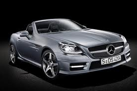
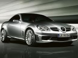
I always admired the front end of the SLK, reminiscent of the SLR supercar.

Now it's modelled on the SLS.

I think they've ruined it - what do you think?

imagesCA6AMZ6F.jpg


newslk.png
 
The new front end makes the car look heavy. That or there is a massive engine under the bonnet. I have to admit that I think it looks repulsive.
 
The new front end makes the car look heavy. That or there is a massive engine under the bonnet. I have to admit that I think it looks repulsive.

Agreed - it looks stodgy, almost "Americanised"
 
I had a look at one over the weekend. It looks quite nose heavy, quite American in style and anonymous.

Doesn't make me want to swap my R171 for it, at all.
 
I saw one in the flesh and thought it was rather striking and a car I'd like to own.
 
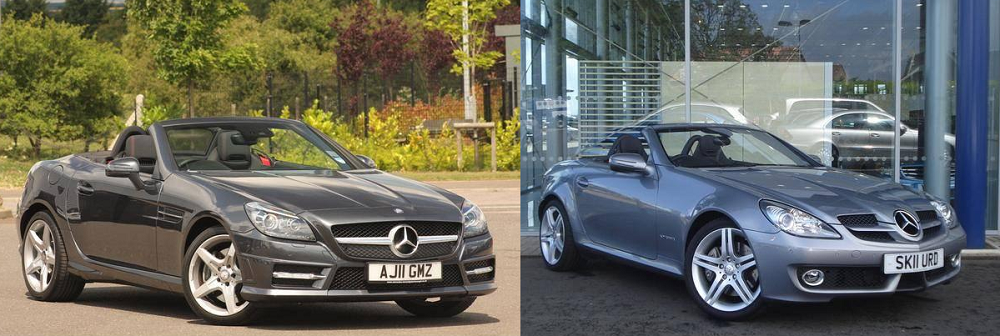
I'm obviously fond of the previous SLK, but I think it's looking a bit tired now, whereas the new model has a more honed, purposeful look to it. You can trace a clear feminine-to-masculine styling progression from R170 through R171, to R172.

In order to compare R172 and R171 it helps to see them from roughly the same angle:

r171r172.png


A few things I don't like about the outgoing model are the "cleft lip" front valance (thankfully not present on my 2004 model) and the heavy-handed front bumper treatment of the 55 AMG version, with its squared-off edges and fussy side vents. I've also never really got on with the gaping look of the grilles either side of the central star (evident on darker-coloured models), which I've managed to give a lift on mine by fitting the optional 'chromed' wings.

Oh, and I agree with *** (:eek:) that the new model looks good in the metal - photos don't always do it justice. It's also quite sensitive to spec - the front needs the optional Xenon headlights to look right.
 
I think those photos (thanks) confirm my thoughts all the more.

To me, the new one looks like a bit of a bloater.

I recall when MG launched the B and BGT in America, with fat bumpers giving a more stodgy look - that's the impression I have of the 172, particularly where the headlights meet the bonnet :(.
 
I like the new front end. I think the bigger problem (which is present on this and the prev version) is that the back end is too high. This makes any front end look heavy and hung down to me.
 
I can't say that I like the new corporate front end.

I was never much of a fan of the 171 proboscis, but neither do I like its replacement much.

Slight thread drift: I was parked next to a new CLS yesterday. Brand new in black, it looked terrible. I have seen a few new ones in the flesh but not up close, until now. The press release thread photos which kHz posted ages ago didn't bode well, IMO, and it looks much worse in real life. And the worst part of all is that it doesn't look good from any angle. No redeeming features! It looks heavy and bulky from all sides; the back is fussy and unhappy, particularly around the lights; the front has that huge horrible bottom-feeder fish maw... Give me the old version any time.
 
As I've said a few times with regard to the new SL, but the same applies to the SLK. It completely defeats me why any manufacturer would take a successful design and ruin it in the name of progress. The new models look like Ford Mustangs and if that's what you want you should buy one - a Mustang that is. It's like they took away the flair of the design in the interests of conformity. You'd think they'd learn. Sales of the SL apparently dropped off greatly in 2008 when they changed the front, and the 2012/2013/2014 (take your pick) new model is even worse. Sure some people will buy these cars because they're the latest and have supposedly the latest technology but I'll wager they'd sell far more if they'd left the timeless, successful designs alone, perhaps only tweaked them a little, but still updated the technology and mechanics etc.

I read in one of the MB magazines that the bonnet of the previous SLK was supposed to be modeled on the F1 cars - as was the SLR.
 
I like the new front end. I think the bigger problem (which is present on this and the prev version) is that the back end is too high. This makes any front end look heavy and hung down to me.

The back end is similar in proportion to the original R170 SLK. The R171 hides the bulk quite cleverly (it's also high - just doesn't look it).

The new car doesn't look so bad in the flesh - depending what colour it is. But the front is uninspiring even when it's in a colour that doesn't jar.

It's probably the best of a bad generation as regards current C, SL, E, CLS, and SLK. I think MB is in its Ford Scorpio phase.
 
Saw some new ones in the dealer and think it looks really good, much better than the old model. Seems to suit it much better, a bit like a mini SLS. Funny, I hate the new R230 front-end but like the SLK? One reason I'm not changing my SL for a new one.
 
I still think that the R170 is the nicest front end. Especially in black.


.
 

Users who are viewing this thread

Back
Top Bottom