• The Forums are now open to new registrations, adverts are also being de-tuned.

new SL63

The profile view makes it look as though a new C class Sport nose has been grafted onto an SL as an afterthought.

The front does not flow with the lines of the car, and the three quarter view looks angular and bitty in design.

The SL should be a graceful touring convertible, a GT convertible if you wish...this looks like it's trying to be a sports car (at 2000kg or so) and just not making it.

The SL Malcolm drives is by far the most graceful design to date, it's been a little defaced in the new model IMHO.
 
My god that is awful - nothing works together and it appears to be a mishmash of design elements.

The nose section is just shocking

Some will love it but not me
 
The new corporate nose is to clumsy and brash.....

rear-1.jpg


adam
 
It looks much better in silver.White looks too Bling
 
how to ruin an elegant car .. facelift it, put lots of unnecessary adornment that does not suit or blend, and hey, facelift!

It's like wearing a polyester suit over a silk shirt.

horrible!
 
Right several things:

* White is gorgeous.
* Yes they're extremely similar to the 997 Turbo's but, tbh, they're hardly going to be deliberately the same are they. If there IS sharing going on, maybe M-B would be able to make this public? Hold on - they do live in the same city don't they (Stuttgart)...
* The 1 at the dealers has a car-specific plate (note the "SL 63" on the middle). It has a different, more 63-y style alloy that hopefully will be the standard fitment.
* As John says it could be the light highlighting the raised bonnet, but it does look a bit ugly and 'obviously pedestrian-impact related'. Is it more so on that dealer 'F1-spec' car than the white 1?
* LOVE THOSE BRABUSES!!!!!! SO CUTE!!!!!!

My £1.37-worth.

Edit: the front is clearily doing a Pagoda. Again we'll all get used to it in a few months.
 
Last edited:
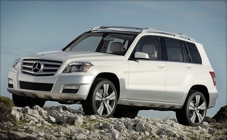
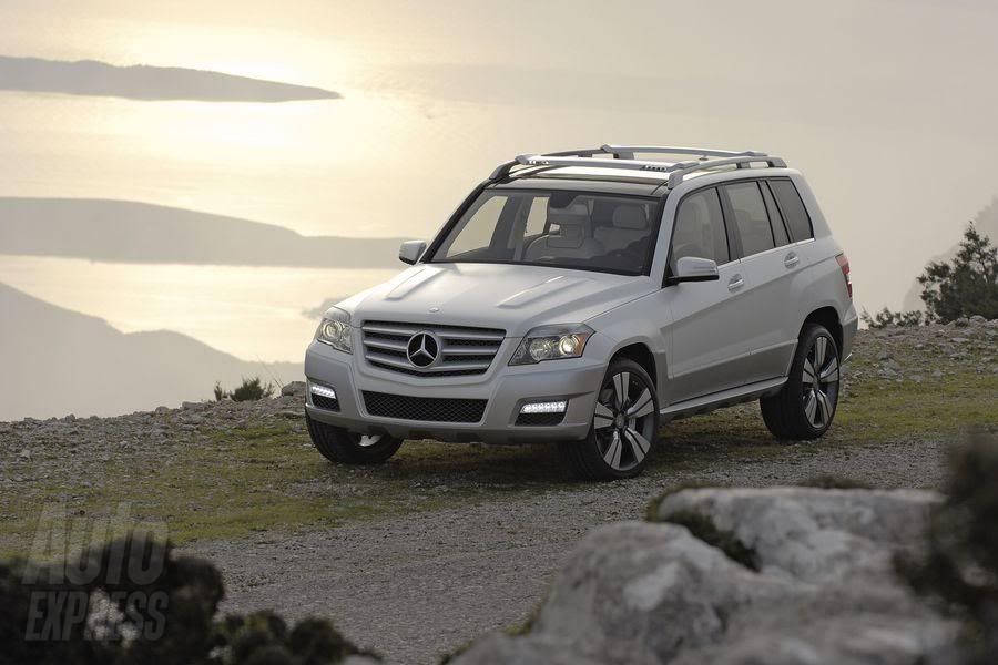
I quite like the look of the GLK. Just a pity it apparently won't be available in RHD.
 
Horrible Flash-Harry wheels from downtown Miami. And where has the wonderfully distinctive and aesthetic front end gone. One of the most beautiful cars ever is no longer.

and whats wrong with Flash-Harry wheels? :D
 
Its got an A class look, thats why you like it :D
Seriously, I think it has a rugged off-road look about it. And that to me is how off-roaders should look. Leave absurdly sloped space-ship looking windscreens to Peugeots. And hugely sloped rear windows are wrong for 4x4's and all estate cars as they just destroy stowage space. IMO 4x4's should exhibit function triumphing. Sports cars can choose to prioritise form- they should look beautiful like your model of the SL -to me one of the most beautiful cars ever made.

Or put it another way, models should have long slim legs. Weightlifters need legs like tree trunks.
 
And what's wrong with Novas?? :D
 
And what's wrong with legs like tree trunks? :D
 
On balance I like the look, subtly more modern than the previous version and I think in non AMG form it will look fantastic, elegant to. Can’t say I am a fan of the currant AMG body add-ons on any of the models C63, E63, S63 etc as to me they are more Max Power than Mercedes.
 
Nice models are niiiice. But some are just awkward looking!!

Anyway I'm off now. Meeting Yasmin Le Bon for a Ruby whilst Simons doing a come back tour. :D
 
Seriously, I think it has a rugged off-road look about it. And that to me is how off-roaders should look. Leave absurdly sloped space-ship looking windscreens to Peugeots. And hugely sloped rear windows are wrong for 4x4's and all estate cars as they just destroy stowage space. IMO 4x4's should exhibit function triumphing. .

For business there is nothing worse that an estate car with a sloping back, it makes a huge difference as to what you can get in it
 

Users who are viewing this thread

Back
Top Bottom