• The Forums are now open to new registrations, adverts are also being de-tuned.

2016 W213 E-Class - Revealed

**Old person alert**

I really like it. :D The exterior is very similar to the W212 facelift, apart from the rear view where it has the smaller back lights similar to the C Class, but even those are starting to grow on me a bit now.

Love the interior shots, especially the dash in picture 6. I'm personally not too keen on the two tone quilted one, though have no doubt that others will love it.
 
Not for me, I find the car too conservative. I prefer the w212 with 2 separate headlights giving a sharp and aggressive look. Now this car does not have it and looks far too plain.

Overall, they have done a great job on the inside but the outside does not work for me... For now anyway. Maybe it will grow on me later?
 
Not for me, I find the car too conservative. I prefer the w212 with 2 separate headlights giving a sharp and aggressive look.

But they stopped that one in 2013 when the facelift was introduced?

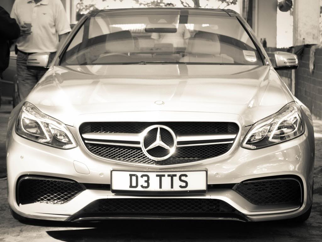
I think mine looks a little bit aggressive. (Not in a shouty way though) :D

Front%20in%20Greyscale.jpg
 
so some feedback.. as i have been following the 213 closely

1. very conservative, which in todays landscape may not work, however i think its more timeless in its lines.. perhaps like how the 125 and 124 had a shard shoulder line through the body.

2. the headlamps, as intelligent as they are are so cluttered and busy..

3. the rear looks great, not sure why the need for reflectors in the bumper.. otherwise it may have been such a boring design, so perhaps it was a signature mark

4. the amg and sport variants look ok, better than what the 212 is/was but the grille is too blobby

5. wierdly, the classic grille variant doesnt look at great, perhaps it needed sharper edge lines, not so much of the curved chrome

6. the interior is great but will age very quick.. and i think in the poorer guises with out hand stitched tops on the dash will look like a huge lump of plastic, so 50:50 on this possibly for now.

7. the rear qtr angle is my fav for the 213... the front is too busy.

8. with the AMG variant, the nose on both 205 and 212 shows off a greater slope and less projection, so works well in my opinion, the mainstream models are where i think they have given the saloon a pig snout.. and im not a fan obviously

anyway i expect to have one in 2 years time lol - looking fwd to seeing this in the flesh as i think it is a huge step fwd from the 212.. but not all in the right direction
 
But they stopped that one in 2013 when the facelift was introduced?

I think mine looks a little bit aggressive. (Not in a shouty way though) :D

Front%20in%20Greyscale.jpg

Daveenty, yours looks mint and still has that aggressive look. So I do like it a lot!! Shame that they move away from the double headlights though... Maybe I am old fashion now!?
 
Whilst I do accept that the target for the E is quite conservative, I think the external design of the 213 is very disappointing (I prefer the f/l 212). I think also that the C, E and S now look much more similar to one another than the equivalents did back in the Sacco era.

Interior looks nice however.
 
MB is going the Audi "Russian Doll" route with the C, E and S classes

Still, looks stylish and elegant. Like it.
 
Like The Boss, I've been following this development for at least a couple of years.

Whilst I think the interior is in Mercedes terms "2 steps forward" to use a phrase recently from their marketing team, there is a few niggles. For instance, with the light interiors, you would think they would colour match door sills to something other than black. Likewise, the seat runners, maybe a white/cream match, again, the black runners jump out.

The seats all look to be leather(ish). No fabric options? Or are we only seeing the Designo interiors???

The exterior, well given the fanfair and time spent on the car, there nothing jumping out as being a development beyond the current C and S Classes. As we are a little onwards from those development launches, I was expecting a little something extra...there is a missing head-turner, which should be there is any Mercedes that goes by.

I'm presuming there must be a lot under the skin or there asking a hell of a lot for people to be buying into a changed dashboard. How many years have these 1200 R&D guys been working on this for?

I'll be honest, I'm struggling to know which is the AMG front from the leaked pictures. That can't be a good thing if I am a buying punter.

I can actually see people, previously buyers of the E-Class, looking at the C-Class and thinking I'll have that instead as that's similar, where in the past, you wanted to aspire to a E-Class.
 
Last edited:
I like the looks from all angles apart from the front which I find a tad aggressive. The dash is a definite improvement for me.

Does any one else think the more aggressive fronts may engender discourtesy from other drivers? E.g here comes another Mr Toad, stuff you mate.

Only from Audi drivers :D
 
Really like the way the 213 looks although the rear lights and doors all look the same as the 205 albeit larger. The inside again is another step up from the 212, as that was from the 211. Looking forward to seeing the "hot" version.
 
I love MB, I really do. But what are they playing at with exterior styling??? S, C, and now E Classes look almost identical. Just slightly different sizes. I just can't see why they need to make so many different models look the same.

The interior however looks the part.

Great job on the inside.

Lazy job on the outside.

Ant.
 
I could not bring myself to buy a facelift W212 as much prefer the older front.

However, the facelift (W212) has now grown on me and so cannot wait to see the W213 in the flesh.

Big fan of light coloured interiors and the publicity shots appeal to me (#2 and #3 moreso than picture #1).

Personally, I like the family DNA-look and think the E will slot nicely between the C and S given I like the W205 front end.

Oh, not yet 50 :p
 
I love the interior but not sure the exterior looks different enough in the car park to tell if its a S or C Class. And in one of the shots it appears the star is back on the bonnet which I like!
 

Users who are viewing this thread

Back
Top Bottom