But the dash screen doesnt match up on the SLS either!?!
sls is perfect symetry (apart from instrument cluster ofcourse)
just angle in last pic was off.. as a comparison, the sls interior above is perfect and stunning and looks like it flows..
the sl interior as follows is ill aligned and distracts from an otherwise pleasant place
and the slk is even worse
i just feel that the interior is a big let down in terms of the way they have designed the layout.. it looses its elegance and overall smart sophisticated design that the rest of the car shows.
other members may ask why i am so worked up..
the reason is simple.. i have pride in the brand, and i always am happy when they develop the brand in a way that makes it shine proud and has design cues in keeping with its history and evolution to its future, but when i see this, it just saddens me to think that this could ever be put up on the hall of fame as one of their best car designs ever..
more thought should have gone into the layout.
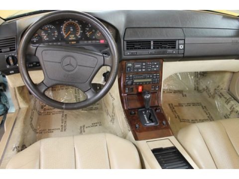
i mean this dash from 90's is also misaligned
but it does not disturb too much as the mis alignment is quite substantial, it does not look like a mis fit, whilst the others do, in my opinion only ofcourse.
i think they got it just right on the outgoing model
oh well.. as long as those who can afford it are happy, i guess that is all that matters...
its just one less car i would potentially be aspiring to... for now anyway


